UI Kit: 7 rules to Succeed

Rule #1: Don't reinvent the wheel

I have seen this rule violated too often, causing many problems later. The code accumulates and becomes ugly very quickly.
A good foundation for any UI kit is to use firstly what the browser provides, namely native components.
A great and simple example is an ordinary Button component.
If you have worked on any UI kit that you've inherited from a previous developer, I'm sure you've seen this construction before:
.png)
Let's list the problems with the above code:
- You only enable what you deliberately described as props
- Once you need to add any other on* event (onKeyPress, onChange, etc.), you will be forced to change the UI kit repository.
- Developers tend to make this too custom, with props like onMySpecialClick that usually only wrap the native events.
- Types are wrong
- All event props return the event payload with all the native data, but they are lost.
- A consumer would only guess how far the functionality of this button can go.
- Components with custom APIs are hard to use with third-party libraries, adding a burden to your shoulders
- Most integrations with third-party libraries, such as react-hook-form, are often easy with native elements and hard with custom ones.
- Having the Button be a button (API-wise) makes it more versatile.
- The Button body is restricted to string values only
- You can't pass other values.
- You can't pass other UI elements.
Let's look at a much cleaner version:
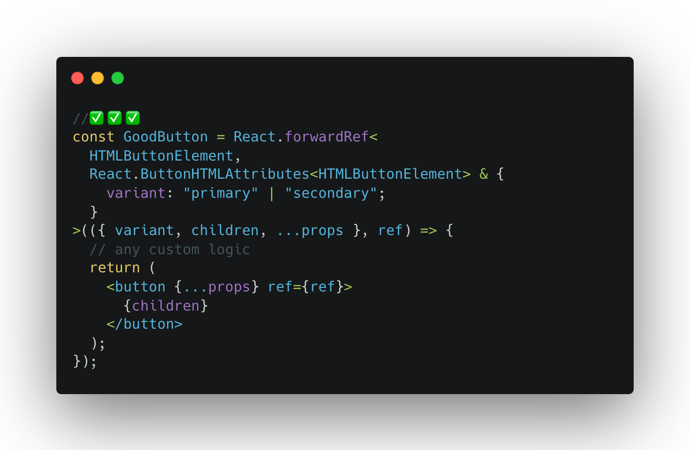
Improvements:
- Now the consumer can use this button anywhere it is possible to use a native button
- All the Button features and custom variant can be used
- Types are correct and match the underlining implementation
- Ref works
- Children are not restricted, but you can override it if needed
- Pre-condition for accessibility
It is essential to utilize the features provided by the browser before customizing it. It does not apply to all components, but the basic ones should abide by this rule.
For more intricate components, consider using a headless UI kit, such as Tailwind's https://headlessui.com/.
Rule #2: Start Testing Early

If you intend to add tests “later,” forget it. It is probably the biggest lie in software engineering.
Tests are essential and required for developing reliable software. It`s especially true for packages that many consumers might use. Who wants to use a dropdown that doesn't open when you type something? Or any other issue?
If you follow rule #1, you will only need to test a custom behavior, as there will be no point in testing native features. Isolate your tests and only test what is intended for the component you cover.
Good tests will lead to a good component API (aka props).

Recommended Tools to Use:
Rule #3: Reduce internal state with IoC

Components with the internal state can be useful. But can also become challenging to manage when you need more control over them.
Let's revisit the previous examples. Here's a stateful component:
.png)
As a consumer of this component, you face several issues:
- No control over the modal visibility. If you have a side effect that should close it, you'll need to render the component itself conditionally.
- No control over the search bar, which is not easily accessible.
- No control over the action items. What if you only want the Cancel button to be visible? Do you add a new prop hideCancel: boolean?
- It's hard to test as the component grows.
- Expanding the component's functionality is hard, as you have to consider all edge cases.
Notice how many times control was mentioned? As a consumer, you don't have it. As the UI Kit author, you didn't provide it.
So, how can we solve the control problem?
Inversion of Control (IoC)!
If you need to get more familiar with the concept, we recommend reading Kent C. Dodds' article on the Inversion of Control.
In short, IoC is an approach to developing an API, such as Props in this case, so that the control is on the consumer side. Meanwhile, the provider holds the main business logic and restricts the consumer to a set of rules: the component's capabilities and API types.
Take a look at the updated example:
.png)
Now that the Modal is stateless, we gain several benefits:
- Control for the title, content, action, and visibility is returned to the consumer
- Testing this component is much easier
- There is no if-branching for the edge cases
- Expanding this component is easy, and it's less likely you'll have to since the consumer has so much more control now
But what are the downsides? There is one clear, but not that big. With more control on the consumer side, the state handling will be repeated whenever the Modal is used.
But that's alright. The UI Kit should provide building blocks, and the consumer application should utilize them efficiently. Here's how:
.png)
With the building blocks provided by the UI Kit, the consumer can prepare more specific implementations of the components, such as AcceptInviteModal or WarningModal, and so on.
Rule #4: Don’t overcomplicate props

When you violate rules, it can impact development speed and quality. Even if you are following best practices, you may still end up in a situation where you need to deliver custom functionality that does not fit into those practices. For example:
.png)
Initially was a nice and clean Dropdown component, rightly typed and covered with tests. However, someone added a new property called overrideValuesOnReset to meet a business goal. This change seemed alright but was quickly followed by the addition of forceOpen and onSearchClear to override the component's internal state. Unfortunately, there was no time for refactoring.
As you can see, bad code accumulates quickly. Your once nice and flexible component can become cluttered with just a few new props.
The solution is simple: if you have a pressing need, do what you need to do, deliver, and then come back to refactor it. Doing only half the job will dramatically increase the development cost, and nobody likes to use a UI Kit with overrideValuesOnReset props. Do your part responsibly so that you don't have to struggle in the future.
Rule #5: Ensure accessibility

Gone are the days when simple single-page applications (SPAs) with no accessibility, 10k spinners, and funny animations were popular.
Accessibility is now a required and well-deserved standard, and, like with tests, better to start early.
The rules above will be a good precondition for meeting the goal. Native components are already quite accessible, and it's your responsibility to ensure that:
- It is not worse than native
- You have covered all the custom cases
- You have tested it
Accessibility is complex, but you can meet the basics with the right approach.
Check the ARIA guide page for a set of examples.
You might also consider using a headless UI Kit like Radix or Headless UI, which already provides great accessibility features. Additionally, consider using the ESLint plugin or a testing tool like axe-core for React.
It does not matter how you achieve the goal, as long as you achieve it.
Rule #6: Define boundaries

Defining boundaries, rules, and practices is essential. Ensure that everyone can follow them.
Examples:
- Write documentation and request it from others
- Use ESLint with a solid set of rules that work for you
- Pay attention to necessary refactoring
- Monitor test coverage and agree on a threshold
- Agree on file structure, and consider creating a template folder for new components
- Use code quality measurement tools, either locally or remotely
The goal is to establish what is acceptable and encouraged and what should be avoided. Make sure you and your team are on the same page and agree on what is best for everyone, including the business.
Rule #7: Granularity and Composition

It should be clear that using simple and small components is a good way to develop a UI Kit. With that level of granularity, your components should be easily composable.
For example, consider the modal discussed in Rule #3. It accepts dynamic content such as children, titles, and action buttons, so the consumer can easily compose the final component to best suit their needs.
When developing a UI Kit, you can export simple components and pre-composed ones like the ConfirmationModal, which could be used regularly. This is a middle ground between exporting components that are too simple or too complex.
There are multiple ways to structure your components, and it’s up to you to prefer. Here are two examples to consider:
Bonus Tip: Make your UI Kit Available

Your UI Kit should include a demo page to increase engagement. Nobody can envision the look of your component code in their head. Additionally, larger kits can be hard to navigate and find components, even for the creator.
If you need to learn how to prepare a demo, use Storybook! It is a good tool for avoiding confusion within your team regarding available functionality, and not only.
With the correct setup, many features can be enabled, such as:
- Accessibility testing
- Demo with different states or combinations
- Deployable demo page for your non-dev teammates
- A documentation repository
- Quick access to the API references
- Integration with design tools
- And many more
Have an outstanding idea? Let's engineer your breakthrough! Contact us ➡️


Let's engineer your breakthrough

79015, Smal-Stotskoho St. 1 Ukraine
50-062, Plac Solny 15 Poland


